Home » Data Stories

Tag: Data Stories

Is Our Air Getting Cleaner?

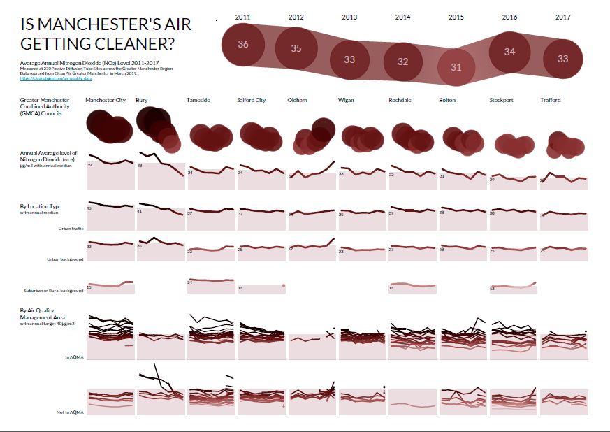
Here’s an example of a Decision Gallery based on public data from Clean Air Greater Manchester.

The existing data is organised around individual monitoring station locations. This makes it hard to see the big picture of whether air quality is really changing or not. The interpretation is also focused on the achievement of Air Quality Targets (less than 40μg/m3) rather than the big patterns of change.

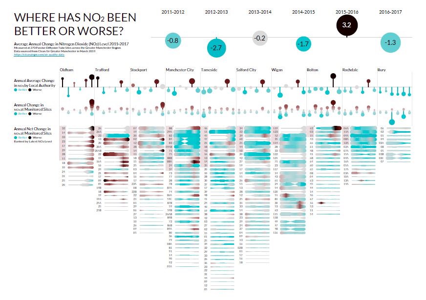
Our series of 6 Insight Canvases explores the historical Diffusion Tube monitoring station data. It tells a richer story about how Air Quality is changing over time across the Greater Manchester Combined Authorities.

There are two broad questions:

  1. Is Air Quality getting better or worse?
  2. Where should interventions be focused to make it better?

You can download the Decision Gallery PDFs here

These are designed to be printed on A1-sized panels for a physical gallery but could also be adapted for online content.

With major Congestion Deal and Clean Air Plan initiatives launching in the region, a Decision Gallery is a way to reveal the evidence of whether change is working.

Many more data sources could  be explored by this Decision Gallery, including active monitoring NO2/PM stations, traffic flows & vehicle emissions, population proximity, and health service demands.

A Causal Canvas would also explore the claimed links between congestion, air quality and pollution-related deaths.

Exploring Bed-Blocking Pressure

A common media topic over the winter months is the increased pressure on the NHS coupled with the snappily-named ‘Bed-Blocking’; patients who are well enough to leave hospital but are still occupying a bed. We might see this attributed to a ‘crumbling adult care system’ caused by ‘sweeping cuts to local council budgets’. Is the cause really so straightforward?

This visualisation links the NHS England Delayed Transfer of Care to Bed Capacity data for the last 13 months to seek new insights. As with many things in the NHS, the picture isn’t as simple as the media sound bites would suggest.

Click on the image below to launch the interactive dashboard on Tableau Public:

Bed-Blocking Grab

The distribution of Transfer of Care process delays and bed occupancies vary by individual Trust within the Local Authorities they serve. Some are improvement bright-spots, others aren’t. The creation of metrics for ‘Bed-Blocking Pressure’ and ‘Bed-Blocking Effect’ produces geographic Trust ranking.

This is just one example of how we can use visual analytics to explore patterns in your data for better decision-making.

Get in touch to find the stories hiding in your data.

Caveats : There’s still work to do on the geocoding of some Trusts and the use of historical bed capacities/occupancies instead of just the most recent quarter. We could try and factor-in the higher occupancy units. We’ve created a separate drill-down into the Delayed Transfer of Care root causes which reveals insights for combined Local Authorities & Trusts. Get in touch if you’re interested.


The Traveller Caravan Count

The UK Department for Communities and Local Government publishes a statistical count of the number of caravans on both authorised and unauthorised traveller sites across England. The count takes place every January and July and includes both ethnic Gypsies and Travellers and non-traditional travellers.

This visual storyboard shows how this caravan count has changed over time, how it varies by season and the shift to private sites. It also compares Local Authorities by caravan demand on authorised and unauthorised sites.

Click an image to visit the interactive storyboard.

Story4
Local Authority Traveller Caravan Count